How to read an inflation report

In this post, we will take a deeper dive into the inflation data and how to read and interpret it. As usual, US data will be a primary focus here, but other countries typically follow a similar pattern. Note that data collecting and calculation methodology may vary between countries, and also within the same country at different time periods, so any comparison should be made with some caution.

This is a further expansion of the previous post that has a deeper overview of inflation as a phenomenon and its importance.

Note that this post is about CPI as a measure of inflation (albeit generally accepted and probably the best proxy for it) and should not be confused with actual inflation. Also, the scope of the report is the entirety of the US and there will be material regional variations in the inflation. For example, housing prices have had different dynamics over the course of the last year, with the West Coast generally cooling down faster than the rest of the country.

Where and when it’s being published?

In the US, the Bureau of Labor Statistics is responsible for inflation reporting. It tracks and publishes multiple indices, including consumer price index (CPI, which will be our main focus), producer price index, and import/export price indices.

CPI is typically published around mid-month as a news release first, followed up with a formal publication of the table in Excel format shortly thereafter.

What does it look like and how to read it?

In its raw form, the data looks like this:

BLS CPI-U

Let’s reformat it in a more legible format and add a calculated column (“Contribution”) and also hide some less relevant columns. The full table can be found here.

There are a few columns left that are the most relevant to understanding the report:

  • Indent level - effectively indicates the grouping of each line item. Higher indent line items roll up into lower numbered line items (you can see it in the relative importance column). For example, “All Items” further breaks down to “Food”, “Energy”, and “All items less food and energy”.

    • Note that not all rows are presented in the basic report and thus breakdown of certain line items does not add up to the line item itself.

  • Relative importance - this column represents the weight of each line item in the overall index

  • Unadjusted indexes - the raw value of the index as of a specific month

  • Unadjusted percent change / seasonally adjusted percent change - % change of each specific index from a year ago / a month ago

With that out of the way, let’s dive into the numbers themselves, annual change in particular.

For the 12 months ending July 2023, the CPI Index increased by 3.2%. The food component of the inflation increased by 4.9%, but given its weight in the overall index, it had only the impact of 0.66% in the headline 3.2% number. We won’t discuss every single line item but want to highlight a couple of notable changes:

  • Energy overall is down 12.5% YoY and contributes to an almost 0.9% decline in the overall index

  • Shelter measurement is up 7.7% and contributes to a 2.7% increase in the CPI index. This means if the shelter has been 0, then the headline number would’ve been close to 0.5% vs. 3.2% read currently.

On Inflation

This one is going to be a little bit different. For the last 2 years inflation has been front and center for most countries and it is definitely still an issue that impacts the economic and fiscal policy of all major economies.

As a disclaimer, most references below would be focused on the situation in the US, but concepts are applicable to virtually all countries. Also note, that I will try and separate two parts of this matter - inflation itself as a phenomenon and measurements of inflation. As you will see later, that distinction matters. As a final preface note, this is a such broad subject that certain topics will be covered at a high level and expanded in future posts.

Some key reference numbers to set up the stage

Below are just a few reference numbers that would allow you to understand the scale of each number in relation to each other (everything as of July 2023 or the most recent available date).

The above numbers ignore a myriad of other financial instruments (e.g. derivatives or crypto currency) and also alternative investments (Private Equity / Credit, Venture Capital, Hedge Funds) and private companies (e.g. Trader Joe’s or your neighborhood barbershop ).

Also, note that these numbers are a mix of “flow” and “state” numbers. Let’s imagine a lake that has a river passing through it. The volume of the water in the lake is a state number. The volume of the water passing through the lake through the river is the flow. Extrapolating this concept to the finance world, the total amount of debt is the “state” number, but the amount borrowed or repaid and the interest is the “flow”. To put it into a practical example, the yield for the US government debt has been in the 1-2% range during the height of the pandemic and now hovers in the ~ 4-6% range, depending on the duration-specific debt tranche. Using the mid-point of each range (1.5% and 5% respectively), it means that, in theory, the cost of servicing $31tn of the debt (“State”) went from ~ 0.5tn to ~ 1.5tn per year (“Flow”). In practice, the actual amount of interest paid by the government depends on the rate of issuance of each tranche since the government uses financial instruments that as short as a few weeks (a change in interest rate would impact the cost of that debt almost immediately) to 30 years (if the government pays interest that has been prevalent for the debt tranche many years ago and it will take a while for those funds to be due and have a need for refinancing).

Note that the financial ecosystem is not a closed loop within one country and a lot of US debt and stocks are owned by foreign entities and individuals and vice versa. The impact of this can be largely ignored since the same economic forces apply to stocks and bonds regardless of who owns them

Why does inflation matter?

Daily life

Simply put, inflation is a gradual and often almost unnoticeable increase in prices of goods and services. As an example, movie ticket prices went up from ~ $6 in the early 2000s to almost $10 now for essentially the same service.

Another practical consideration is that the measurement of inflation is embedded in a lot of real-life contractual matters. The largest example is Social Security which is subject to Cost of Living Adjustments using one of the inflation measurements. Another common example is rent which often has increases tied or capped by inflation measurements.

Companies

In a simplified framework, any company is a vehicle that takes inputs (labor, materials, and fixed assets) and turns them into a product or a service to be sold as an output. Inflation has a direct impact both on the input and output side of things.

On the input side, inflation can be disruptive if it’s not controlled or cannot be passed on to the customers.

Similar story on the output side of things - inflation can cause the company to increase prices, but often it’s subject to industry-specific factors, such as competition or contractual prices being fixed for a certain period of time.

Investment portfolios

There are plenty of investment alternatives that can suit your needs, but the most common ones are stocks (either individual or portfolios (ETFs, mutual funds) that track a certain index (e.g. S&P 500) or a specific sector; and bonds (government and public).

The typical reaction to tame inflation is raising interest rates. As a practical matter, it increases the costs of debt capital for all borrowers.

Stocks represent shares in companies and are impacted by inflation and rising interest rates in multiple ways. To understand which stocks will go, let me introduce the concept of Price-to-Earnings ratio (P/E). Simply put, it’s a ratio of current stock price to earnings (i.e. net income) per share that is used as a proxy for how valuable stock is on a relative basis. Companies with high growth prospects tend to have higher P/E ratios since investors anticipate that their money will grow faster (on a relative basis), compared to companies with growth not being as fast. Other way to look at it is how many years it will take to earn your money back, if the company will not grow at all and will keep earnings stable.

Let’s now further dive into how inflation and rise in interest rates impact earnings. Generally speaking, higher interest rates combined with inflation should result in lower consumer demand, higher costs of labor and materials, and higher costs of borrowing. There is a potential offset with the ability to raise prices, but the higher cost of borrowing is a reality for everyone. P/E for the S&P 500 is now around 20, which is considered high by historical standards, but let’s use this as a proxy. A 1% interest rate increase in interest rates would result in a $130bn incremental cost of servicing all corporate debt mentioned above and it’s a direct hit to earnings. At 20 P/E this translates to $2.6tn of market capitalization dropped out given everything else stays the same.

The above obviously is a simplified framework, since P/E itself would change year over year, but it should give a directional and quantitative sense of where things are going.

S&P 500 and Fed Funds Rates

Is there a magical number?

While exact numbers can vary, generally 2% inflation is considered a “good or acceptable” level by economists and policy decision-makers as it is deemed to balance maximum employment and price stability. Historically this has been a goal and actual measurements hovered around this value with some variations.

Anything below 2% is considered dangerous since it may spiral into deflation and associated economic decline issues. The most recent example in a large economy is Japan which suffered from deflation. One would ask why declining prices are bad since people can afford more, but imagine the situation, where people expect that prices will go down and thus wages, are expected to go down or stay flat too.

Inflation above 2% is considered dangerous given that it can potentially spiral out of control. The most extreme example is Germany during the Weimar Republic (vividly portrayed by Erich Maria Remarque) or Zimbabwe more recently where inflation reached a staggering 79,600,000,000% per month.

What caused a recent spike in inflation?

Inflation; CPI; BLS

The price of any good or service is a matter of supply and demand. Water is virtually free at home where you can just turn on your tap, but can be multiple dollars per single bottle at the airport, where supply is limited to select vendors. Thus any change in prices (and inflation) is a matter of both supply and demand.

The demand side of things

Years of pandemic lockdowns resulted in excess savings by consumers that now are going back to the economy through pent-up demand for goods and services. Increased spending is not spread evenly across sectors.

Another layer is the geographical spread of demand. We all know a person or two who spent some time working remotely from some location away from the home office. Some of them decided to stay for good and thus permanently shifted their consumption from one place to another.

The final layer is structural changes in consumption since there have been shifts from goods (e.g. buying equipment to work from home) to services (e.g. increased vacation travel) and within those segments.

Supply side of things

It’s truly a story of each and every sector individually. Below is a high-level overview of two major sectors: energy and housing.

Energy prices

Let’s start with a couple of things that have touched almost every single sector - energy commodity prices. The energy commodity price shock caused primarily by the Russian invasion of Ukraine (and also impacted by actions of OPEC) has a very visible direct impact on consumers through increased fuel prices, electricity, and heating costs. Although the US produces almost as much oil as it consumes in aggregate, oil prices globally act like communicating vessels since every producer will do what is best for them and sell where the price aligns the best (subject to limitations of international trade regulations and transportation costs). The second level impact is that fuel costs impact almost every other single industry to various degrees. Your food needs to be transported from the farm to the distributor, and then onto the supermarket. Even your barber needs to pay for the gas to get to work or pay for public transportation that runs on electricity or gas.

Housing

Now let’s move on to one of the largest industries - housing. Around 2/3rd of Americans are homeowners so let’s focus on that first. Housing supply is split between the primary market (i.e. purchasing a home from a builder or building yourself) and the secondary market (i.e. purchasing an existing home). The market is further divided between single-family houses and multi-family units.

Primary market supply is really a local story since zoning and regulation drive how many permits are issued. Another consideration is the lead time and cyclicality of the housing market. It takes 7 - 12 months to build a home, which means homebuilders often have to anticipate the demand well in advance. When they are wrong, it’s either too much supply and selling price has to decrease or too little and they can sell for more. Naturally, one would think that they may err on the side of caution and build with the lower end of supply in mind.

The secondary supply side of things is really a derivative of how we got here in terms of mortgage rates. For almost a decade since the Great Financial Crisis, the Fed kept overall interest rates low and then even lower to ensure smooth economic recovery and then growth. A partially unintended consequence here is the fact that people used this opportunity to finance or refinance their mortgage at a really low (and mostly fixed) rate. Imagine someone with a 3% mortgage thinking about moving now. Any place that person considers, would either require to more than double the mortgage rate or downsizing in terms of home price to keep the monthly mortgage costs low. This means the person needs to think really hard if they want to sacrifice their lifestyle (either in terms of money available to spend elsewhere or livable space/location/quality of the home) or not move at all. The supply of available homes suggests it’s the latter which implies that short supply on a secondary market will stay tight for a bit longer.

Who is in charge of inflation and what do they do about it?

Given the importance of the matter, both legislative and executive branches of the government would stay close to the issue and try and manage inflation through fiscal (e.g. government spending, taxation, and public stimulus) and monetary (e.g. interest rate environment or supply of money) policies. Monetary policy, however, can move things relatively quickly. Interest rates can be changed overnight. A new fiscal stimulus (e.g. PPP loans) would need to go through the legislative branch of the government and then be implemented by the executive branch. So let’s focus on the main actor in monetary policy - the Central Bank.

In the US, the Federal Reserve System (Often referred to as “the Fed”) is an equivalent to the central bank and has inflation as the second out of three main goals mandated by Congress.

The Fed has four major tools that can be used to achieve goals:

  • Open market operations: directly purchasing assets on the balance sheet which at a large scale often called quantitative easing. The total amount of assets (mostly government debt) held by the Federal Reserve adds up to $8.3 trillion

  • Reserve requirements: effectively changing a % of assets/deposits that regular banks need to keep in reserve that adds up to $3.2 trillion (Other deposits held by depository institutions).

  • Interest rates, which has two components:

    • Federal Discount Rate - the interest rate charged by the Fed to lend money directly to the borrowers. This adds up to ~ $266bn as of July 2023.

    • Fed Funds Rate - the interest rate charged by financial institutions to each other, but guided by the Fed. This rate is most commonly referred to as the rate that guides the overall level of interest rates and it’s now in the 5.00% - 5.25% range with around $105bn of loan volume.

Out of all tools, the Fed Funds Rate has been considered a key tool. Although the nominal amount of loans borrowed under this rate is relatively small, the Fed Funds Rate in practice dictates the interest rate environment through its impact on the general interest rate environment (and particularly SOFR and Prime Rate). Both of these rates, consequently impact a myriad of loans. If you read the fine print for your credit card agreement or a variable mortgage rate agreement, you will likely see that a Prime Rate change would result in a change in the monthly interest you pay. Similar logic applies to corporate and government borrowings, which will adjust based on the interest rate environment. Practically speaking Fed Funds rate impacts all $61 trillion of the debt (with a caveat that some loans and bonds are at a fixed rate, but will eventually be repaid and need to be refinanced).

SOFR, Fed Funds Rate, Prime Rate

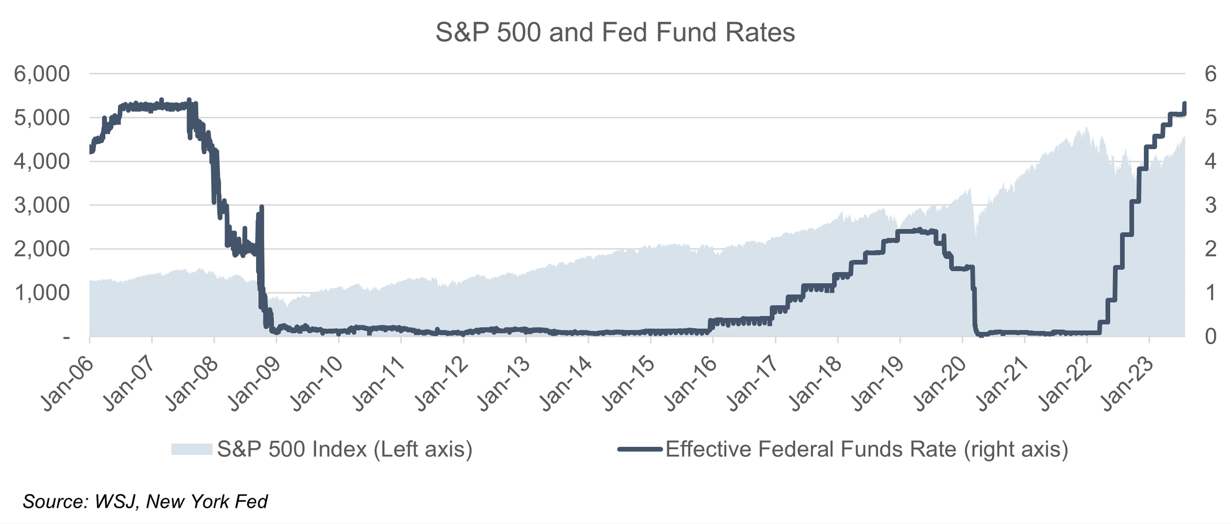
With that out of the way, let's discuss how interest rate change (increase in particular) works to combat inflation.

Individual consumers

Naturally raising interest rates would make things more prohibitive for consumers to finance with debt. Quotes for new mortgages and car loans will go up and might make you rethink your purchase decision and delay the spending. On a similar note, interest rates offered by banks will rise and will make it more enticing to save your money and earn interest as opposed to spending now. This eventually curtails consumer demand and thus results in a slowdown (or even a decline) in prices for goods and services.

Companies

All businesses would face higher costs of borrowing, which would take some time to trickle through the system given that some debt is issued at a fixed rate and variable rate loans reset at specific intervals (e.g. monthly or quarterly). Immediate impact would be seen only if a business would want to borrow completely new money. This eventually would result in a business not being able to increase the available supply of goods due to capital constraints. So far it’s potentially the opposite of what is to be achieved.

In a more distressed situation, some businesses would face a need to cut costs, including payroll and other expenses. Payroll cuts, consecutively suppress consumer demand. Cuts in other expenses, in turn, impact businesses that are in the B2B segment (e.g., Microsoft Office license for each employee). This, would again, take some time given that some expense line items have contracts that are fixed for a year or longer (e.g., insurance policies that are renewed annually or multiyear leases). This process is much more slow-moving and might take months or years to reset spending levels given contractual obligations. Again, this results in decreased demand and a decline in the prices of goods and services.

Government

The government is a major contributor to the GDP and has to consider interest rates too. Although U.S. position as a reserve currency allows for some flexibility in borrowing and printing money to pay debt, during times when inflation runs high, printing money is a less viable option given that it counteracts the goal of lower prices.

Another consideration is local governments which don’t have the joy of being able to print their own money and thus have to balance spending with the costs of servicing debt.

Inflation measurement and associated issues

With all context and background out of the way, let’s focus on how this very important number is calculated. As noted at the beginning, the below definitions are focused on the US market and will vary for other countries. It’s commonly measured by the Consumer Price Index (CPI) or Producer Price Index (PPI), with some deviations of both used.

First of all, inflation is a really hard thing to measure. In this spirit, CPI is supposed to measure the cost of consumption change for all customers. We all have different consumption preferences - some people never fly (and thus airline ticket price change will not impact their daily life), some people don’t have a car (and thus gas, car insurance, and other associated costs are not a factor for them) and only 2/3 of people are homeowners (and thus their cost of living would change due to different factors compared to renters). The Bureau of Labor Statistics (BLS) does its best to approximate the average experience of the population as it relates to the cost of their consumption.

Secondly, these measurements vary from surveyed numbers (e.g. asking people how much are they willing to rent their home for) to observable numbers (e.g. visiting the store and seeing the actual price paid by someone for a certain item as quoted on the price tag). Some observable numbers are based on aggregates made by other entities (e.g. J.D. Power new vehicle price index or US DOT for airline fares).

Finally, numbers are based on a sample that is supposed to be a proxy for the entire population. This is a commonly used method in statistics and generally yields a result that is acceptable with a certain margin of error. For example, prices for commodities and services are based on ~ 94,000 different prices collected each month. For the housing and rent data, a sample of 8,000 households is used as a proxy each month (or 48,000 for the entire year).

[Chart with components of CPI]

With that context in mind, let’s take a closer look at one of the largest single components of inflation. In BLS methodology shelter accounts for ~ 1/3 of the index and thus any change in the measurement of shelter cost (primarily rent and Owners Equivalent of Rent (OER) would have an outsized impact on the inflation output.

OER definition:

"Owners’ equivalent rent (OER). The OER approach to measuring price change for owner-occupied housing started in the CPI-U in January 1983 and the CPI-W in January 1985. The OER index is designed to measure the change in the rental value of owner-occupied housing. In essence, OER measures the change in the amount a homeowner would pay to rent, or would earn from renting, his or her home in a competitive market. It is a measure of the change in the price of the shelter service provided by owner-occupied housing."

Base OER estimate (i.e. what is the base number that then changed to derive inflation) is an estimate

"The number of owned housing units, the number of rented housing units, and the average rent value were taken from the decennial census. The estimated average owner equivalent rent value was determined by a linear regression on Consumer Expenditure Survey property value, income, and number of rooms. The resulting regression coefficients were applied to decennial census values for the same independent variables to estimate the average owner’s equivalent rent for each segment. The following is the nonlinear regression that was used:

oerval = bo + (b1 × propval) + (b2 × propval2 ) + (b3 × income) + (b4 × rooms).

In this equation, oerval = the value the home would rent for, propval = the market value of the home, income = the income of the consumer unit, and rooms = the number of rooms in the house. The actual regression coefficients were determined uniquely for each index area"

Change in OER is derived through the change in rent observations

"The sum of the current (t) pure rents for sampled, renter-occupied units within a segment, weighted by the owner weights, is divided by the sum of the weighted pure rents six months earlier (t – 6). This ratio is used to represent the 6-month change in the OER index for all owner-occupied units in the segment"

How this methodology may cause a problem.

CPI is definitively a key focus at the moment and the key driver in monetary policy decision-making at the moment (since unemployment is low). Thus it is paramount to get this number correct as changes in monetary policy (read Fed Funds rate) impact our everyday life through changes in borrowing costs for consumer debt (mortgages, car loans, personal loans) as well as changes in the business environment (cost of borrowing for business, changes in stock market in anticipation of higher interest rates and potential recession).

The spirit of the CPI is to be a measure of the average change over time in the prices of consumer items—goods and services that people buy for day-to-day living (BLS Handbook, Chapter 17, Page 1)

Thus CPI would capture the average change in prices and in practical terms it would capture the average price experience of all of us. However, there are some parts of the CPI (discretionary goods and services) that most of us will not purchase in any given year and thus will not experience the change in the price.

For example, a car can arguably last for more than a decade to the increase in car inflation impacts only a portion of the population that is buying a car in any given year.

It gets more dramatic when it comes to OER. There are 83.4 million owner-occupied households in the US and between new home sales and existing home sales around 6 million houses get exchanged each year. Which makes around 7.2% of houses being bought and sold each year, or put it another way, the average owner-occupied house is sold every 14 years.

In any given year, the remainder 92.8% of homeowners, who haven't bought or sold, would have housing costs pretty much unchanged (excluding a minor portion of individuals with ARM mortgages and whoever decided to refinance, which typically would result in a lower mortgage rate). The cash that goes out of the door stays pretty much the same.

Now the rent, which is a proxy for OER change, would most likely change for most tenants in any given year (don't have a good data source for a fraction of leases that are annual or less than annual, but one would assume that it's a vast majority). In a 1 year horizon, rent is pretty much a spot market, but owner-occupied housing is not.

The problem starts when economic decision-makers use CPI, which seems to not accurately reflect changes in housing costs for owners in any given year and is used to make decisions based on the claim, that it is.

Think about it this way: The Federal Reserve's target is to reduce inflation, which is impacted by OER. OER change is calculated using a change in rent, which is not directly linked to changes in interest rate. Raising interest rates actually impacts housing costs of ~6 million (or less in a recession) of homeowners who buy and sell in any given year ~ housing spot market. Raising interest rates actually impacts everyone else's lives through the economic slowdown and associated issues.


Presentations checklist

Often results of financial models will be presented in a format other than Excel, most likely PowerPoint. This post is a checklist of a somewhat common errors that can be avoided if a presentation is double or even triple checked.

Formatting basics

A good presentation will have lots of things consistent throughout:

Fonts and sizes.

A good rule of thumb is to have on main font type and a few consistent sizes for different elements (i.e. heading and main text have different sizes but same font)

Presentation colors

Crisp looking presentation will have consistent colors across elements

  • First of all, there should a few main colors that are used in a consistent order (i.e. if slide requires only one colored element then a single color should be used for formatting)

  • Consistent table heading colors. If a PowerPoint presentation requires tables then they all should have same heading formatting and ideally same formatting elsewhere (i.e. font sizes, etc.)

    • Pro tip - format tables in Excel in the same size you want to paste in the presentation (i.e. height and width) so when you paste and adjust size the font will have same color

    • Pro tip 2 - pasting from Excel to PowerPoint as PNG would be the most memory efficient approach since the size is limited

  • Consistent chart formatting

    • Colors should convey the same information throughout the presentation. For example, if you compare multiple companies using charts then same color should indicate same company across presentation. Same goes for time periods (i.e. a year should have same color throughout presentation)

    • Units of measure (i.e. in the heading or next to the axis and their formatting)

    • Headings (i.e. embedded in chart or in a separate text box)

    • Having or not having data labels on the chart itself (or data labeling only certain items)

  • Ideally, you would have a nice looking pallet designed for you before the presentation that you can add using Office themes, but if not you can design one yourself and carry between Excel and PowerPoint

  • Balanced looking slides. Depending on the context you generally want to keep slides consistent in the term of content they have, i.e. a chart / table / multiple charts and tables and text box with bullet points. Having all text slide is acceptable in certain context but might be hard to read or process in a brief time devoted to each slide.

Other considerations

Numbers should tie

This is probably the single most important mark in the checklist. Often when developing the model you will have intermediate results that you will present and you want to always make sure that you have final numbers across slides so its easy to tick and tie.

Another consideration here is having consistent units (i.e. millions or billions of dollars) across presentation and also formatting them consistently, i.e.:

  • For thousands - “K” or “k” after the number

  • For millions - “m”, “M”, “Mln”, “Mn”

  • For billions - “b”, “B”, “Bn”, “bn” after the number

Word usage matters

Another important consideration to go extra mile is to have consistent use of language, for example:

  • Company name (i.e. having LLC at the end of not)

  • Limiting use of company abbreviations / professional jargon or spelling them out for new users (especially using ambiguous KPI’s)

Small details

There are lots of small details that often are

  • Slide numbers - should be present and formatted / located consistently. Makes easier to refer to a certain content over phone call or email

  • Company logo - also generally good to have and present at the same spot of each slide

  • Slide heading - should have consistent location, font sizes

  • Frankly, any other slide design element should be consistent across the deck.

Bottom line

There are many ways to make presentation look wrong and surely I did not catch them all here. But at least you have a sort of guideline on key things to be looking for and framework to spot other issues. In any case, it is all about your content and message and formatting just makes those things look better and crispier.

If you’re a beginner in a financial modelling I highly recommend starting from the first post.

Hotkeys and keyboard combinations

Look, you do you, but learning hotkeys and not switching between mouse and keyboard has been the single most important improvement in Excel productivity.

The second most important is being able to type without looking at the keyboard. Pro tip - get a blank mechanical keyboard and it will make all the difference. Once you’re committed to learning all letter locations, there is no way back.

Back to hotkeys. There are multiple ways Excel shortcuts work:

“Alt+” combinations

“Alt+” combinations are probably most important for financial modelling.

First of all, there are “Alt+1”, “Alt+2”, etc. that will summon whatever you have in quick access toolbar (more about quick access toolbar customization here and here).

Then, if you just press “Alt” in Excel you will notice that there are letters appearing on ribbon headings (i.e. H highlighted for “Home”, “N” for insert). This is a cue for you to be able to be able to summon any command in ribbon by pressing certain combinations. This is really powerful since there is no need then to use mouse to click on those commands. With time you can learn a lot of them by heart. For example:

  • “Alt + H + J” - “Cell Styles”

  • “Alt + N + K” - “Create a chart”

Fun fact about “Alt+” combinations. By holding “Alt” and pressing combinations with numbers you can yield different off-keyboard signs. For example, “Alt+3+6” will result in a dollar sign ($). This actually works across applications.

“Ctrl+” combinations

“Ctrl+” combinations are primarily used for navigation within the spreadsheet / workbook. For example, pressing “Ctrl+Right Arrow” will cause you to go the cell at the right end of the range / table (i.e. last cell with value / formula in the range).

Among the most used shortcuts is the “Ctrl+-” which will (depending on selection) delete row, column, or a cell / group of cells.

“Ctrl+Shift+” combinations

Pressing “Ctrl+Shift+Page Down” (or Up) will cause you to select multiple worksheets at once.

“Ctrl+Shift++” will results in inserting new cells or rows / and columns (depending on a selection).

VBA macro based keyboard shortcuts

If you’re into personal macro workbooks and custom macros you probably know that you can assign unused keyboard combinations to summon them. This is really handy to customize Excel for your own personal needs.

For example, I have added “Wrap text” macro to “Ctrl+Shift+W” combination so every time I encounter oddly looking cell with text that goes over edges I can make it wrap in a cell instantly.

Excel add-ins and hotkeys

If you have custom add-ins installed (often used to speed up formatting) beware that they often will take over some unused keyboard combinations and if you already had combinations attached to custom commands then it might prompt two commands at once.

Don’t forget about F-keys

F-1 to F-2 keys are useful to learn as well. A few notes on them:

  • Some of them are redundant. For example, F10 has the same effect as “Alt” which is located much closer to your usual finger positioning

  • Some of them are underdogs of modelling. For example, F4 (repeat last action) comes really useful when you want to format the sheet in a consistent manner (so instead of applying formatting to each cell from scratch you can just keep repeating last action)

  • Some of them can be annoying. For example, F1 (Help) is often accidentally pressed instead of “Esc” and when it gets frustrating when Excel starts loading “Help” menu. Often financial modelers take that key out or try to disable it via code

Bottom line

I highly recommend learning the ropes as it comes with keyboard combinations and try to be able to use Excel with a keyboard 99.99% of the time. There are still some actions are somewhat faster with a mouse (i..e. editing or moving shape), but those can be done with the keyboard as well which saves a lot of time that is spent moving your hand back and forth with mouse.

If you’re a beginner in financial modelling I highly recommend starting from the first post.

Ways to format cells

Cell styles function

Excel has a handy built-in functionality to carry formatting within and across spreadsheets and keep it consistent - Cell Styles (“Home - > Styles”). Using this will definitely improve speed and efficiency of your modelling efforts:

  • You can make a change in formatting of the style and it will apply to all cells with that style

  • Changing model color theme would also affect all cells with style (this way you can recolor the model to client’s or other colors instantaneously)

  • If applied throughout Excel it almost creates your personal brand in formatting that can make your work more recognizable. It goes hand in with Office Themes (essentially a color / font theme that applies across your Office products and that you can carry across Excel and PowerPoint)

  • You can even add cell styles to quick access toolbar so it can be summoned by “Alt+1” or “Alt+2”, etc. instead of “Alt+H+J”

Some drawbacks of cell styles:

  • Some financial models carry a baggage of cell styles from other models (this happens when you copy sheets across workbooks) thus rendering cell styles functionality unusable. Attached is an example of a bad sheet that is seemingly empty but carries over hundreds of cell styles

  • Not all (or even a majority) of Excel users are not aware of this functionality so they will format cells manually and thus might force you to do the same

  • It takes consistency to apply styles across your spreadsheets

An alternative to cell styles is a hybrid approach when you format cells manually, copy formatting across spreadsheet using format painter, and sometime use cell styles. In case you work with someone else’s Excel book or share work it makes sense to use this hybrid approach.

Note that basics of cell formatting can be found in my earlier post.

Example of cell styles

Below is an example of default cell styles I have in my models / Excel workbooks. It follows industry conventions such as having blue font for hardcoded numbers or “-” for 0.

Excel cell styles

The way formulas are designed is that you can overlay some formats on each other. I.e. apply formula format first and then border to change only border property.

Below is an example of how “Border” style is designed. As you can notice only “Border” property is checked. This means that applying this style will only change border property without touching any other properties.

Border style.PNG

Lets take a look at another example - “Inputs 2 dig” (as you might guess this is for inputs and having 2 digits in them).

You will notice that this style changes such properties as number, alignment, font color, protection, but not border and fill.

I always recommend to separate border and fill format from the others since it can be used to convey different information. For example, different fill colors might highlight cells with the most important information of different types of inputs (i.e. historical numbers vs model drivers that are changeable). Having a border often indicates that cell has a different formula from the others in a row / column. The takeaway is that fill and color property can and should be used to convey information about the cell.

Inputs 2 digits.PNG

I have attached the entire spreadsheet to this post so you can review different cell styles for yourself. I highly recommend to try and learn them before applying or even developing your own set of Excel styles that are suited best for your work.

Note on macro based Excel add-ins

There are some useful macro based add-ins that can be used to automate model formatting (i.e. Training the Street macro add-in that or those developed internally by corporations) that can be tremendously helpful.

I don’t use them personally but highly suggest trying them out to see if it works for you. The drawbacks that caused me to stop using them are the following:

  • Conflicts with hotkeys. Excel add-ins often used unused keyboard combinations for their own commands (for example, “Ctrl+Shift+C” leads to nothing in the basic Excel, thus can be used for other commands). Having multiple add-ins (or own personal macro workbook in my case) will cause you to have multiple commands run simultaneously thus rendering each on useless

  • Not agile enough for different styles given that add-ins are locked for certain colors or require some tinkering to adjust colors. This might be frustrating in case you need to adjust entire model colors to certain style (i.e. clients color theme).

Bottom line

I highly recommend trying out different ways to format cells to see what works for you personally and what gets you more efficient in your work. There is no silver bullet, but there are ways to get ahead in formatting and eventually speed and efficiency in your financial modelling routine.

If you’re a beginner in financial modelling I highly recommend starting from the first post.

Setting up Excel

This post is a follow-up to a previous post from 2019. Read that first to get started or go ahead and read this one. Dealer’s choice.

Excel layout below represents an example of customized Excel that helps you improve your work productivity. Note a few changes from the standard layout.

Excel model layout

Customized quick access toolbar

Those are buttons at the very top of the screen (although it can be moved) and they can be accessed by pressing “Alt+1”, “Alt+2”, etc. It comes handy to replace default functions to something that is more useful to you since default functions can be easily accessed from the keyboard (refer to the post from Oct 10, 2019).

I personally replaced default functions with the following (left to right):

  1. Paste Special (Otherwise “Ctrl+Alt+V”). It comes handy when you need to paste values only of formulas without carrying formatting.

  2. Camera (not in the ribbon at all). As the name suggests, it creates a video camera like view of a portion of the workbook which you can paste in other place. Useful for playing with assumptions on one sheet to see the output on the other.

  3. “Watch window”, which is essentially an alternative to camera, although it refers to specific cells only and is often annoying when switching between workbooks / windows (just try and see for yourself).

  4. Format painter. Useful when applying consistent formatting across workbook / cells.

  5. Custom macro for painting hardcoded numbers. I often get workbooks produced by someone else and the first thing I want to know is what is input / value and what is the formula and more often than not workbooks do not follow cell coding guideline so you end up with a need for a macro to to that work for you.

  6. Custom macro to insert zeroes. Often when working with tables you will have values here and there and assume zeroes somewhere else. It is a good practice to paste zeroes instead to let user / yourself know that there are values in there potentially.

  7. Custom macro to multiply all values in range by a certain value. Useful when you need to converts units of measure, i.e. from thousands to millions.

Customized Ribbon

First of all, add “Developer” to the ribbon (“File -> Options -> Customize Ribbon -> Check Developer in the right window”). It is useful for all sorts of things, including macros.

Secondly, I highly recommend collapsing it (i.e. it will not show up until you click on it). This way you learn keyboard shortcuts quicker and also it saves screen “real estate” for the content of your model (especially important for presenting your findings in Excel).

Last but not least, custom colors

You probably have noticed darker than usual Office colors and absence of colors in the quick access toolbar. It is mostly a stylistic choice, but in my mind darker colors have more professional appeal (also you’re sending a signal that you’re not a regular user).

You have probably also noticed the custom spreadsheet itself - more about it in later posts.

How many tabs?

Have you ever got frustrated with the model that has seemingly an endless number of tabs and no structure to them whatsoever? I have definitely encountered a fair share of those.

Below are some principles that one should follow to have good model structure:

Color coding

It makes as lot of sense to utilize different colors to indicate a purpose for the tab. As a good practice you should at least have following categories for tabs:

  • Inputs - sheets where you have input information / historical numbers

  • Calculations - sheets with intermediate calculations (i.e. revenue calculation or other P&L line items)

  • Output - sheets that have output schedules to be used by themselves or pasted in a presentation. As a good practice output schedules should not be referred to by other sheets

  • Technical tabs - for example, a tab with instructions, table of contents, model checks

Balancing sheet size and model size

As a rule of thumb, each sheet should contain roughly equal number of rows / columns. This way you’re not wasting a sheet for one or two numbers

Also note that as model gets bigger it gets slower since Excel has to do more calculations. Having a powerful PC helps, but your users / colleagues / counter parties will not necessarily have same power so you need to stay cautions about model size.

If it gets too large you can split it in a logical way (i..e if it is a model for multiple divisions of the same company you can split by division or if a revenue build-up takes lots of space you can split it in a separate model).

Side notes

Try not to copy an entire tab to your model. It drags a lot of unnecessary stuff like names and cell styles (which can wreck a havoc in your model’s names and cell styles). Best practice is to create a blank sheet in a target model and copy and past just formulas and formats. An even better practice if just to paste formulas and format from scratch.

Sheets also are better grouped in some logical manner (i.e. inputs then calculations then outputs) with blank tabs separating sections. This way it is easier to navigate and edit.

Excel functionality to know

Described below are certain must know functionality that should be in a toolkit of any modeler. Even if you are not actively using them others might and knowing how to use them will come handy when using other people’s work.

Named ranges

Named ranges are commonly use to refer to assumption that will be used consistently across the model (for example, tax rate or CPI assumption).

One cool feature of named ranges is an option to name not only a cell, but also an entire array with multiple rows / columns.

This way, if a model is set up consistently (i.e. same rows / columns have same periods across tabs) you can easily refer to to named range with multiple inputs. I.e. if you have named range in cells “A1:A3” of a certain tab, referring to that named range in the cell A1 of a different tab will return a value from A1 of the tab with the named range.

Some cautions with using named ranges:

  • Named ranges do not work really well when copying entire tabs. If tabs have same named ranges Excel would prompt an error message. If copying tabs is done multiple times then Excel file would get larger and also have a tons of junk names that are not really used. Although it is useful sometimes to be able to see who has been using names (you can see external reference to someone’s drive or named range could contain some company’s name (same goes to cell styles)).

  • Named ranges that refer to multiple cells take a lot of memory thus increasing size of the workbook (i.e. I often see workbooks that are 10s of MB only because of named ranges)

  • There are named ranges that refer to tab only and there are named ranges that refer to entire workbook. Thus you may have multiple named ranges with the same name.

Working with multiple tabs simultaneously.

There is a feature called “Split view” that allows to open multiple tabs of the same workbook simultaneously (or different places of the same tab). This is useful when you want to change assumptions and see how output changes at the same time. Pretty convenient.

There are two alternatives to this function however: camera (not available anywhere in standard Excel view, needs to be added manually through “Quick access toolbar”) and watch window (“Formulas -> Watch window”).

Camera allows to literally paste a piece of worksheet to another worksheet as a camera view (you cannot update values in a camera window, but can see updates). 

Watch window would only shows values of certain cells. Minus here is that you can see cell values only, but no charts or anything else that is happening on the sheet.

It makes sense to put camera for an end user since it is the most user friendly (and not updateable feature).

Conditional formatting (“Home -> Conditional Formatting”)

A very useful feature for making the model more user friendly. For example, you can color a range based on values (high to low) or use it to highlight that something is not right (my default is to use it to highlight error message in the model so user / modeller is aware that something is not right).

Grouping (“Data -> Outline”)

This comes handy when you have rows and rows of data and need to somehow be able to navigate easier. That is why generally you should try to use at least one level of grouping. For example, if you have multiple rows in calculating revenue you can group them in the same group and thus it will imply to model user that those go together.

Note that you should always use grouping instead of hiding rows / columns that is way harder to notice visually.

Also note that there is a “Subtotal” function that allows to sum or do other manipulations with only visible cells which might come handy when you are summarizing only what is in the output.

Workbook / sheet protection (“Review -> Changes”)

These functions are generally used at the final stages of modelling when it is about to be sent out (if at all). By protecting sheet / workbook you can, for example, hide certain sheets or prevent users from changing certain cells (to allow for this functionality, you should have cells at “Locked” position in styles (“Ctrl+1” -> Protection).

Caution. An advanced user can use a macro to break this protection and thus I would not put all my trust into this functionality.

Pivot tables (“Insert -> Pivot tables”).

In short, pivot table is a good way to summarize any data. Imagine you have a data set and you need to have some totals (e.g. summary of sales by region and/or years, or SKU, etc.). This is where pivot tables comes handy: it will be way faster and more convenient that manually writing sumifs both to write and calculate.

There are few limitations obviously:

  • It is hard to filter by date (for some reason it hasn’t been figured out yet)

  • If you have a fixed sized table and it have rows of data added, you will have to manually updated range (fix to this is to select broader range, but then you will have to manually filtered out “blank” data points that pivot table will bring in)

  • Working with nested categories (i.e. sales by country and product) is somewhat complicated since sorting and filtering is not straightforward (i.e. you might need to add one category first, sort, and then add another)

Model formatting

Although this might have been covered to a certain extent it is worth revisiting this topic. 

Separating number formats

Different cell format should be separated. At minimum, separate following with different font colors: inputs (aka hardcoded numbers, blue (RGB 0,0,255) is the industry convention) and formulas (industry convention is black (RBG 0,0,0). 

There are few other instances that are separated from time to time:

  • Cells that are linked to a different workbook and/or tab (so you will have easier time spotting external references)

  • Cells that have formulas different from row / column

  • Historical (i.e. non-changing) numbers (for example, actual financial results for the latest quarter)

There are few variables you can use to format cells: font color, cell fill, and border. Drawbacks of font color is that it can be formatted separately using number format (built in number formats can prompt cells having different colors based on value, e.g. in currency format negatives have red font color regardless of what color you applied)

Cell number formatting

Cell number formatting defines how numbers would be presented (e.g. comma as a thousands separators, brackets for negative numbers). 

Generally, it goes as following “Positive number format ; Negative number format ; zero format ; text format”. As an example, “0.0; “below zero” ; - ;” will yield in:

  • Numbers for positive numbers

  • “Below zero” text for any numbers less than 0

  • “-” (dash) for 0s (this way you will know what is true zero (dash) and what is just a really small number (will appear as 0)

  • Text will show up as text

There are few ways to make number formatting messy:

  • Some users format numbers to appear in thousands or millions (i.e. the value is 1000, but it will show up as 1). Try to avoid it as it might cause confusion

  • Same goes with flipping signs (i.e. “-0.0;+0.0;-”) which might cause a reader to misunderstand the number

  • Also, placing text instead of number is generally not a good practice (for example, you can make all negative numbers appear as a certain text)

When applying this to financial modelling there are few things to note:

  • Some number format can overwrite color formatting (e.g. negative numbers in dollar format (Ctrl + Shift + 4) will always show as red regardless of actual color you put in)

  • Formats should be consistent

Other issues to consider

Themes and colors (Page layout-> Themes).

It is a quick way to change all formatting in the model (assuming that you have used theme colors to format cells / charts at the first place).

As a side note, if you manually format colors (enter RGB colors instead of choosing ones from the theme, then those colors will not change with the theme).

The way themes work is that you can set a specific set of colors that can go across MS Office applications, including PowerPoint. This comes handy when making a presentation based on the model and you want to keep everything consistent.

Tips for writing formulas

Formula consistency

It is important having a consistent formula across row / column i.e. having one formula you can drag across the row for all calculations.

In practice this means giving a bit of extra thought to have formulas consistent so they will flow with updated assumptions (a common error is to have a model calculating correctly for only given set of numbers).

Keeping it simple

It is worth noting that models can become as complex as you want and you can make calculations really precise. There are few issues however:

  • You might end up with a lot of inputs that need to be updated. Thus working with the model will become a time consuming exercise

  • Model structure / formulas can get complex as well and changing them will become an increasingly complex thing (especially if you are being asked to update model logic for certain items)

It is worth spending more time on larger items (as a % of revenue or total assets). For example revenue from the business segment that brings 50% of revenue requires more attention than the revenue from business unit that is 1% of revenue (unless that 1% is growing hundreds of basis points).

As a takeaway, keep the model simple and easy to update.

Marking changes

In case you have to change a formula in a row/column - mark it somehow. Common method is to use border on the first formula that is change (“Ctrl + Shift + 7”).

Working with multiple sheets / tabs

There are a few neat ways to optimize working with multiple tabs:

  • Referring to tab range as if it was cell range. As an example, imagine you have three tabs in the following order: “Tab1”, “Tab2”, “Tab3” and you want to get a sum of cell A1 for each one. You can refer to each tab individually or you can refer to them as “Tab1:Tab3” in the formula. 

  • Utilize “Indirect” formula. If you have a list of all tab names and know location of the data you can refer to the cell just by name of the sheet and name of the cell

  • Utilize “Edit links” functionality. Since you might encounter different versions of the same file linked to another file, edit links may come handy if you just want to update the workbook. The way it works is that you just tell Excel what is the new source workbook and it changes old references to new ones (assuming source workbooks have the same structure)

Other things to note about formulas

  • Use “Flags”. Flags are formulas that return “1” or “0” only and mark dates (for example date of something or time periods before or after and date) events (for example a loan is repaid or drawn). This way you can extract some parts of formulas that used to be IF’s

  • Limit nested IF’s. Nested IF’s means having sequential IF’s going one after another. This is really hard to audit and can lead to errors

  • Use *(A1>x)instead of if(A1>x,1,0). In case you have IF formula that only yields 1 or 0, you can easily replace it with multiplication. Side note: it cannot substitute circular reference switch (which is IF with 1 and 0). There is a subtle difference - IF formula makes only one of the logical calculations, while multiplication by default has only one calculation and thus always will have circular reference

  • Make one calculation and one only. This means that if there is a formula to calculate something, don’t do it twice or more in the model. Otherwise you might end with a mistake if one formula is adjusted 

  • Link sheets books from left to right and up to down. This way Excel works faster (which is not an issue in most models, but can be helpful if a large amount of calculations is made)

  • Avoid using array formulas in large models

    • In a simple way, array formula is the one performing complex calculation in a range

    • They usually denoted with “{ }” brackets

    • Example is a data table analysis (commonly used in DCF sensitivity analysis)


Getting started with Excel

Before we even start, here is a little trick to start an Excel with just a keyboard. Press “Win + R” then type “excel” then press enter. It will summon Excel.

Quick access toolbar

For those who are now aware, it is a row of buttons at the very top of the Excel screen. And it is really useful for the speed since functions can be activated with “Alt - 1”; “Alt - 2”, etc. key combinations and thus can be used to call frequently used commands.

By default quick access toolbar goes as following:

  1. Save (alternative keyboard combination - “Ctrl + S”)

  2. Undo (“Ctrl + Z”)

  3. Redo (“Ctrl + Y”)


So there no reason for keeping them there since there are quick keyboard combinations.

I really suggest customizing it by putting functions that are frequently used. It saves ton of time. You can do it by pressing little arrow on the right end of the ribbon and clicking “More commands” to choose functions from different parts of Excel. You can even assign customized macros to the quick access toolbar and choose from functions otherwise not available (e.g. “Camera” is not in the ribbon). 

My personal favorites to add are: paste special (instead of “Ctrl +Alt + V”), camera (no keyboard alternative), format painter.

Excel settings

I won’t go through all of them, but keep in mind that you won’t need to touch of them unless you face specific problem related to that setting.

General settings

On this tab you can changed appearance of the new workbook (font, number of sheets, etc.) as well as office appearance itself (big fan of the dark mode closest to which is the “Dark Gray” office theme)

Formulas

Calculation options - there are 3 main options:

  1.  “Automatic” - Ok to use unless you have a file with many data tables (commonly used in sensitivity analysis) or workbook is so complex (and/or hardware is not powerful enough) that every time you try to change something (even cell value) you run into a numerous seconds of calculations in between

  2.  “Automatic except for data tables”  - suggested default, useful in most cases.

  3. “Manual”  - have to press F9 to calculate sheet after each change. Not really recommended unless working with a really long to calculate workbook. Especially will not recommend  for the work you have to deliver to an end user who might be not as familiar with this functionality.

“Enable iterative calculations” shouldn’t be on by default since it will cause Excel trying to calculate circular references and won’t prompt an error.

Error checking rules - you would usually want to exclude some errors (e.g. “Formulas referring to empty cells”) that are ignored in the normal modelling practice.

Customize ribbon

Not much customization by default, except for adding “Developer” which can come handy for macros or adding command buttons.

Few other useful things to know

There are multiple other ways you can customize your excel settings / look:

  1. Custom default workbook - you can customize the way default workbook (i.e. the one created when you press “Ctrl+N”) looks like. You can do so by saving the workbook you like as an Excel template named “Book” in a specific folder (varies by Excel / Windows version). This feature is really useful if you have own number styles / color coding built in and want to carry it across your work products

  2. Same goes for the default sheet (the one that is added to any workbook)

  3. Themes and colors - you can create a custom color scheme for your company and carry it across workbook. This comes handy if you want to have all your work product in company colors and / or client colors. Note that themes can be carried across office products (i.e. PowerPoint). This, when mastered, is really helpful when formatting charts and tables


First

Hello world,

The purpose of this blog is to share knowledge and experience in financial modelling.

I have been and still frustrated by poorly designed and built models and hope this will big a small step to a world with better spreadsheets. I also hope this will save your time by providing condensed experience.

Having said that, below are top 10 tips:

  1. Use color coding to separate inputs from formulas

    • Industry standard is to use blue (RGB 0,0,255) for inputs (hardcoded numbers) and black (RGB 0,0,0) for calculations

    • Other examples of special cells that may require formatting are: links to other workbooks (often hard to hunt down those), links to other sheets, formula change (i.e. first cell with a new formula)

  2. Formulas should be consistent in a row / column (depending on a model orientation)

    • Basically, try to use one formula that can be copied across the row / column (depending on a way the model is oriented)

    • This way when assumptions are changed, there will be no need to edit formula

  3. Use consistent formatting across entire workbook (e.g. fonts, colors, layout)

    • This means having same columns / rows for the same period 

    • Model is easier to understand and navigate and also client friendly

  4. Keep model sheets balanced

    • No need to create a sheet for only a few numbers to be inputted

  5. Do not copy entire sheet from one book to another

    • This drags a lot of unnecessary information (cell styles, named ranges, macros, etc.)

    • Better way is to create a blank sheet and then copy and paste calculations and number formats

  6. Do not make same calculation / input same number twice

    • First one is redundant and leads to possible errors if one formula is updated and second one is not

    • One number should be inputted in the model only once

  7. Avoid the mouse

    • Modelling should and can be 99.9(9)% keyboard exercise 

    • It increases modelling speed multiple times

  8. Leave comments. A lot of comments.

    • Ideally, you should have a comment on the source of every hardcoded number you put into

    • Same goes with the logic for large formulas

  9. Make “Ctrl+S” (save) a second nature. 

    • You never know when model will and can crash

    • It is especially concerns large models with lots of calculations / external links

  10. Do not mix formulas and hardcoded numbers

    • Do not have numbers in a formula, unless they are obvious assumptions (e.g. number of days in a week or 1/0 for formula parameters)